


Pickleball Court Colors: What Players Actually Prefer
Color is the first thing a player notices and the last thing most court owners think about. Here's why that gap is worth closing.
Walk past a beautifully designed pickleball court and something registers before you've consciously processed it. The colors. A well-chosen palette doesn't just look attractive, it signals quality, communicates care, and quietly invites people to play. A poorly chosen one does the opposite, making an otherwise excellent court feel tired, harsh, or simply forgettable.
For homeowners designing a backyard court and facility managers planning a multi-court complex alike, color decisions deserve more thought than they typically receive. This guide covers what recreational players actually respond to, what the psychology of color tells us about performance and preference, how the Arizona climate shapes the conversation, and what to know when navigating HOA or facility guidelines.
Color Is a Design Decision, Not an Afterthought
Most discussions about court color start and end with "what's standard." And while there are conventional choices that exist for good reasons, the range of options available today is wide enough that settling for default is genuinely a missed opportunity.
Color affects how a court photographs, how it feels to play on, how visible the ball is in different lighting conditions, and how the space integrates with the architecture and landscape around it. In a market like Scottsdale, where outdoor living is a point of pride and aesthetic expectations are high, a court that looks considered and intentional stands apart from one that simply follows convention.
It also affects whether people want to play on it. That's not a small thing.
What the Psychology of Color Tells Us

Color psychology in sports environments is a well-studied field, and while pickleball courts are a relatively new subject within it, the underlying principles are consistent.
Blue is by far the most popular court color worldwide, and its dominance isn't arbitrary. Blue reads as calm and focused. It reduces perceived visual stress and creates a sense of depth that players find comfortable over extended play. It also photographs exceptionally well, which matters more than ever in an era where courts end up on social media, in real estate listings, and in club promotional materials. Light to medium blues are particularly flattering under the bright Arizona sun.
Green is the traditional choice, borrowed from tennis's long history. It carries associations of outdoor space, nature, and ease. Darker greens in particular absorb heat more than lighter alternatives, which is worth factoring into any Arizona court decision, but in terms of player preference, green remains widely trusted and universally readable. It's a safe choice for good reasons.
Slate gray and charcoal have grown in popularity among players who associate them with premium, modern design. Gray courts feel architectural rather than recreational, which appeals strongly to the homeowner market. The tradeoff is that lighter ball colors, particularly yellow-green indoor balls, can be harder to track against certain gray tones. It's a consideration worth testing before committing.
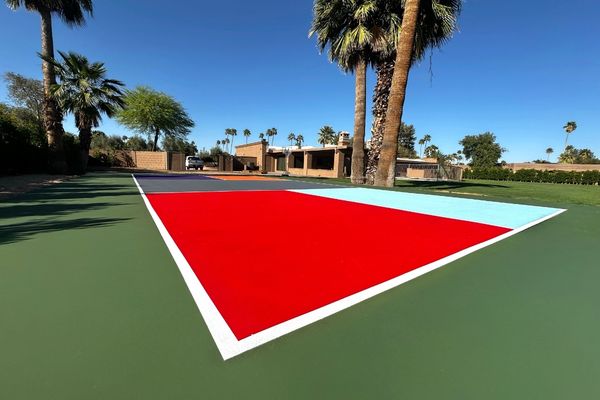
Red and terracotta are less common but increasingly seen in the Southwest, where they complement the regional palette of warm stone, desert landscaping, and adobe architecture. In Scottsdale specifically, a terracotta or warm clay court can feel genuinely place-specific in a way that blue or green does not. The visual contrast with a white or yellow ball is strong, and the overall effect can be striking.
Two-tone combinations are where court design gets interesting. The most functional approach uses one color for the playing area and a contrasting color for the kitchen (non-volley zone). This isn't just aesthetic; it helps players orient themselves quickly, particularly recreational players still developing their spatial awareness on the court. Popular combinations include blue on blue with a shade shift, green with a lighter or darker infield, and gray with a warm accent tone.
How Arizona's Climate Shapes the Color Decision
In most parts of the country, court color is purely a visual and psychological question. In Arizona, it's also a thermal one.
Dark colors absorb significantly more heat than light colors. On a summer afternoon in Scottsdale, a dark charcoal or deep navy court surface can reach temperatures that make play genuinely uncomfortable and, over extended periods, accelerate the degradation of the acrylic coating. This doesn't mean dark colors should be avoided entirely, but it does mean they warrant more careful consideration here than they would in, say, Seattle or Minneapolis.
Medium tones strike the best balance. A mid-range blue or sage green absorbs less radiant heat than a deep navy or forest green while still providing the contrast and visual depth that players prefer over very light surfaces. Very light colors, while cooler, can create glare issues under intense desert sun that make tracking the ball more difficult.
UV exposure is the other factor. Arizona's sun is relentless, and UV degradation fades court surfaces faster here than in most other markets. Choosing a color that ages well, and applying a UV-resistant topcoat during installation or resurfacing is the difference between a court that looks vibrant for years and one that looks washed out within a season. Certain pigments hold their saturation better than others under UV stress. Blues and greens with high-quality acrylic systems tend to perform better than reds and yellows, which can shift noticeably in tone as they fade.
When you're selecting colors for an Arizona court, it's worth asking your contractor not just what the color looks like on day one, but what it looks like after two summers of direct sun exposure.
What Recreational Players Actually Prefer
Survey data from recreational pickleball players consistently return a few clear themes.
Visibility matters most. When asked what they value in a court surface, recreational players rank ball visibility at the top. A color combination that creates strong contrast with the ball, whether that's a yellow-green indoor ball or a white outdoor ball, removes a source of frustration that affects the enjoyment of every single point. This is the most practical reason to avoid very light or very white court surfaces.
Familiarity breeds comfort. Players who have learned the game on blue or green courts respond well to those colors and can feel subtly disoriented on unusual palettes. This doesn't mean unconventional colors are wrong, but it does suggest that introducing them alongside a strong kitchen zone contrast color helps players calibrate quickly.
Aesthetics influence perceived quality. Recreational players consistently rate their experience more highly on courts that look well-designed and well-maintained. A court with a fresh, intentional color scheme signals that the owner or facility cares about the experience. That perception shapes everything from how long players stay to whether they return.
Photography has become a real factor. The rise of recreational sports photography and social media sharing means that players, consciously or not, are drawn to courts that photograph well. Blue and green courts with clean white lines tend to be the most photogenic, particularly in bright outdoor light. A court that looks great in photos becomes a social asset for any facility or property.
HOA and Facility Considerations
For homeowners in Scottsdale's many planned communities and gated neighborhoods, HOA guidelines often have a direct bearing on court color choices. Some associations specify acceptable palettes explicitly. Others have broader aesthetic guidelines about outdoor structures that effectively constrain color options.
The practical advice here is simple: get clarity in writing before committing to a color scheme. HOA guidelines can be interpreted differently by different board members, and a written approval protects you if questions arise later. If your preferred color isn't listed as approved, it's often worth submitting a formal request with a visual rendering. Many associations will approve well-considered designs that weren't explicitly anticipated in their original guidelines.
For club and facility managers, color decisions carry additional weight. Courts need to serve a wide range of players with different preferences and skill levels, hold up visually across years of use and multiple lighting conditions, and photograph well for marketing purposes. A cohesive multi-court color scheme, where all courts share a consistent palette rather than each being a different color, projects professionalism and intentionality that players notice and respond to positively.
Branding is also a real consideration for facilities. Some clubs choose a court color that aligns with their logo palette or overall visual identity. When done well, this creates a sense of place that's genuinely distinctive. When done poorly, it produces courts that look like an afterthought of the marketing team. The key is ensuring that whatever color serves the brand also serves the player.
Making the Decision

There's no single right answer to court color. The best choice for a private backyard court in a desert-modern Scottsdale home is different from the best choice for a 12-court recreational facility in a community park. What's consistent across both is that the decision deserves real thought.
A few questions worth sitting with before you choose:
What's the primary ball color your players will use?
Design for visibility first.
How much direct afternoon sun does the court receive?
Factor in heat and UV degradation accordingly.
What does the surrounding landscape and architecture look like?
A court that complements its environment feels considered. One that clashes feels like an installation.
What do you want the court to say about the experience of playing here?
Color communicates before a single ball is struck.
At Just Pickle Courts, we work through these questions with every client before a single square foot of surface goes down. The right color for your court is out there. Finding it is one of the more enjoyable parts of the design process.
Contact us to schedule a complimentary, no-obligation consultation today.
Interested in more pickleball content? Follow us on Instagram.